Months of hard work and we are now running Signal Flare v2.0. A major upgrade with all the features you’ve been asking for. Let me tell you all about it.
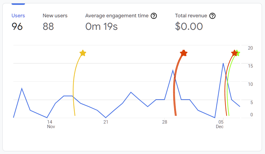
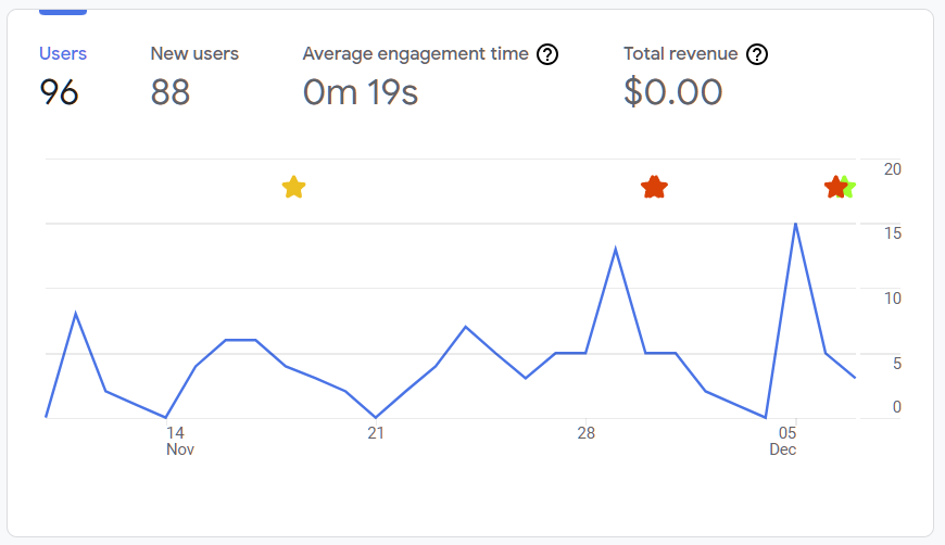
Perhaps the most sought after feature is the ability to color code your annotations. It’s an obvious upgrade to the tool, we were happy to use it ourselves. Now we separate our engineering annotations as Green, and Marketing as Red, and external events each get a color that distinguishes them from our own activities.

But of course, when your annotations start to distract, we can now dial it down a bit and switch off the trails. It’s a subtle thing that makes professional users happy. Actually, it probably makes everyone happy. The trails are more for our branding purposes than they are for the data visualization.

Introducing the Signal Flare Side Tray
Our most egregious mistake with v1.0 was our utterly dismal interactivity with the flares. The old hover effect was slow and unintuitive. It failed to meet the bar we set when we claimed that you could share your notes with your team. It was bad. I now understand Reid Hoffman’s advice about being embarrassed by your first release.
We fixed that. Now it’s good. Real Good.
Signal Flare has a pop-out side tray that reveal the details of the annotation when you click on it. And while the tray is open, as you hover on the flares their details are revealed. It’s exactly as it should have been.

The nice part about claiming a small bit of the page real estate for the side tray is that there’s now a place to put the full Signal Flare UI. We no longer need you to pin the extension to the toolbar, instead we make Signal Flare available right there inside your tools.

We love this new tray feature. Browser extensions are severely limited by the built-in popup experience in the browser toolbar. As soon as you lose focus the popup is removed by the browser and your unsaved data is lost. It’s brutal for Signal Flare. This is especially harsh if you are switching tabs to cut and paste information into the annotation you are trying to create.
But with the side tray, your work in progress notes are preserved while you go about gathering information from other tabs. The frustration relieved by the side tray is immense.
Simply put this is the best version of Signal Flare we’ve ever made.
But Wait, There’s More
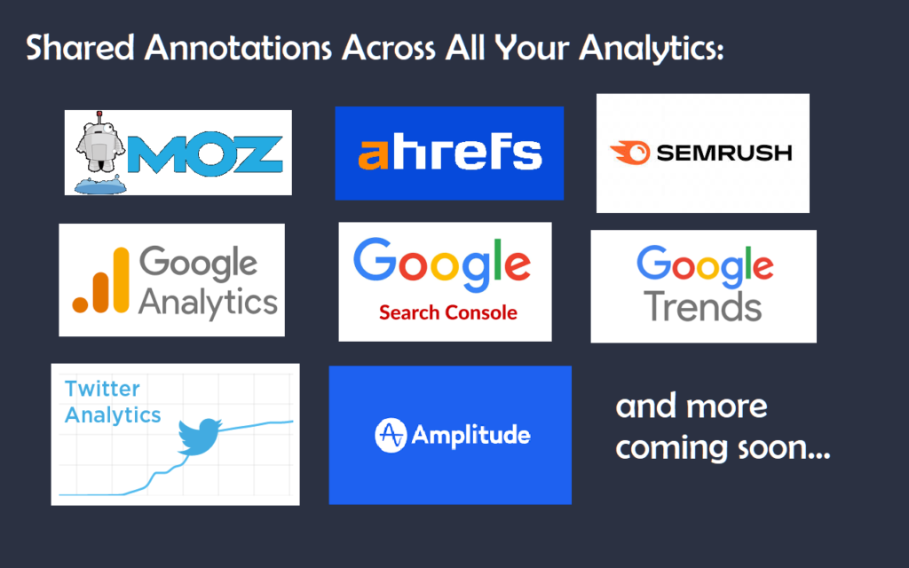
We’re not joking about our goal of putting all your annotations into all of your analytics. In v1.0 we support Google Analytics and Search Console. And now with this Signal Flare Upgrade we’ve started to deliver on our vision and have added many more tools to the party.

